
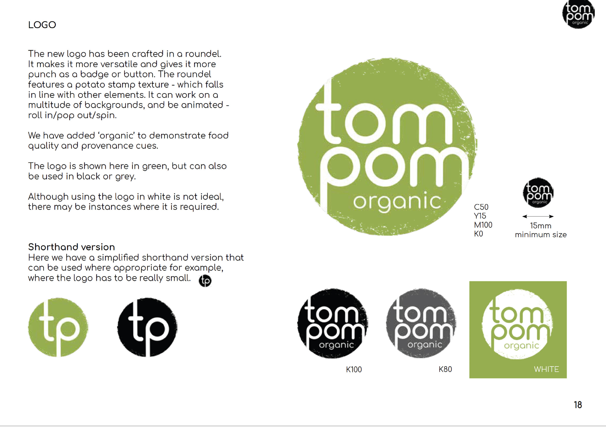
LOGO DESIGN & BRAND STYLING
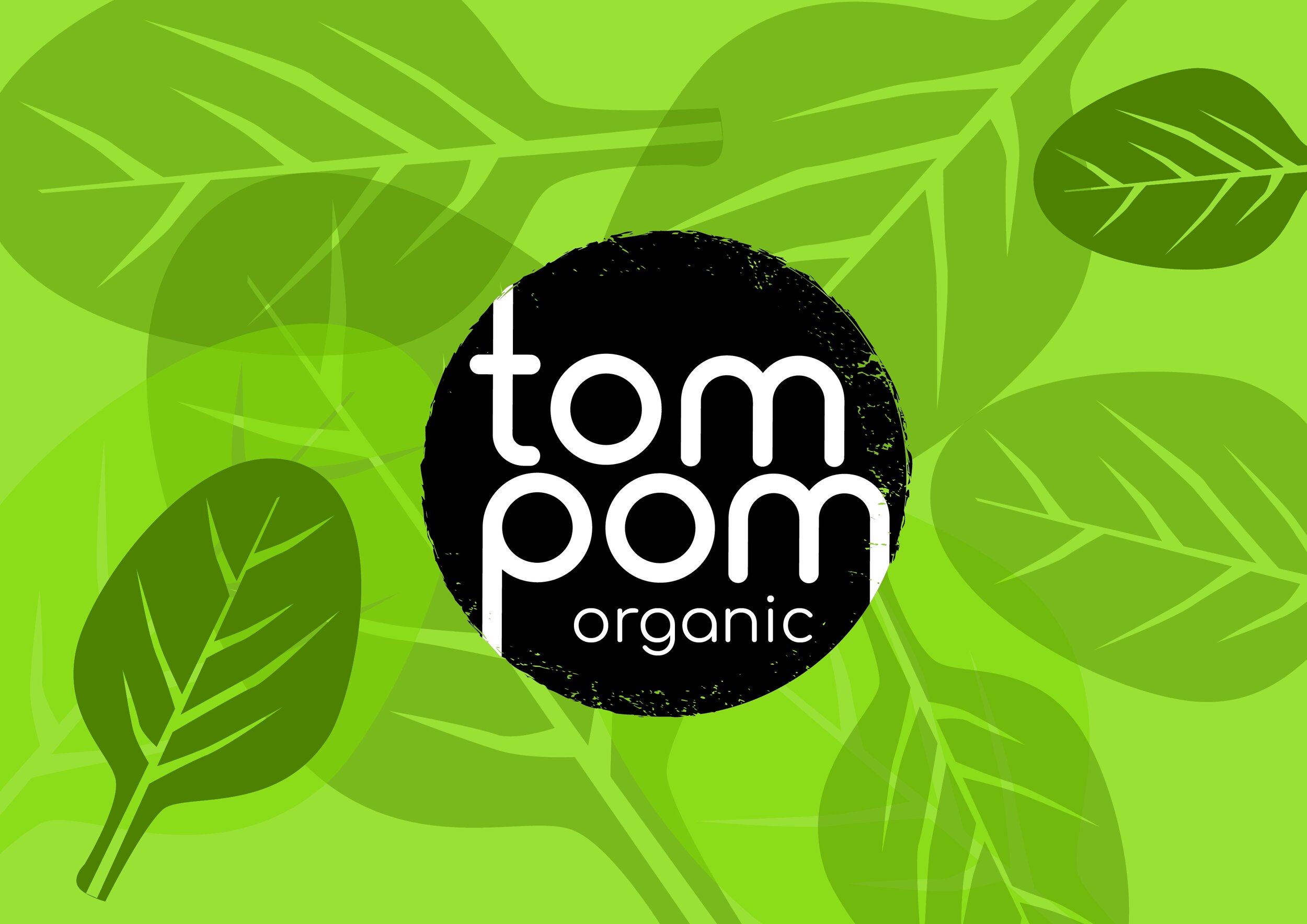
TOM POM ORGANIC
A new positioning, brand refresh and styling brand book for a baby food brand.


Tom Pom Organic produce fruits and vegetable purees, freshly frozen into rings suitable for babies and toddlers. Embracing the principles and process of home-made cooking, Tom Pom Organic are convenient, fun mealtime rings for well-balanced weaning. It’s hand-made in small batch production and all ingredients are sourced from the highest quality, certified organic, small-scale suppliers.
The brief called for a new brand positioning, a logo refresh and brand styling.
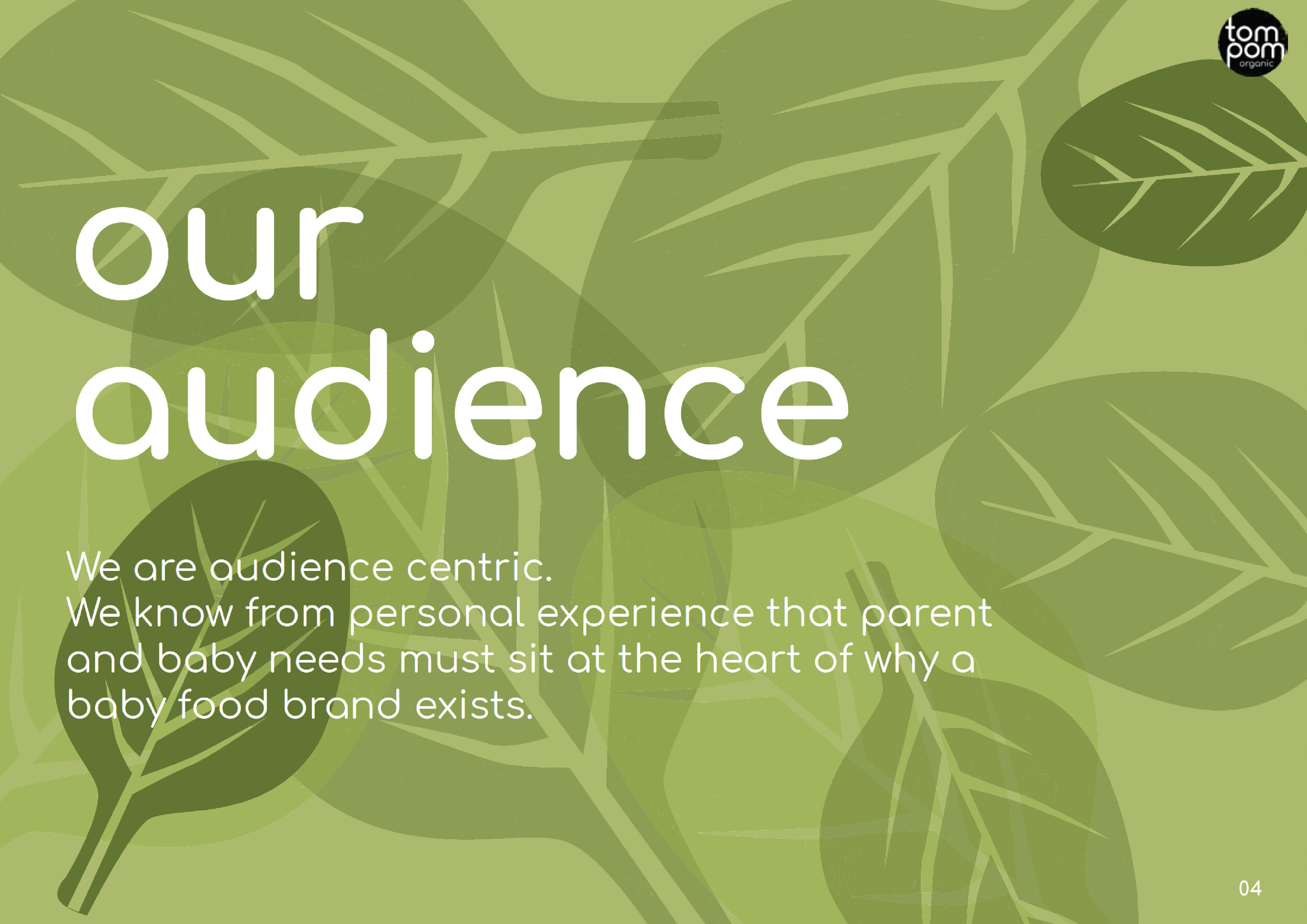
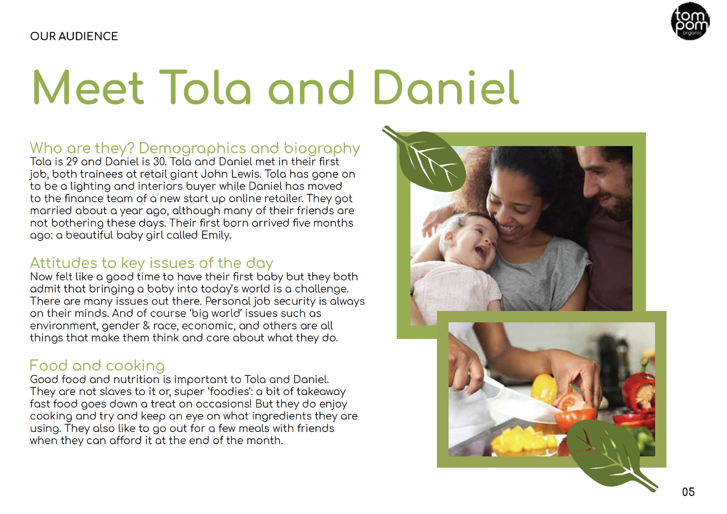
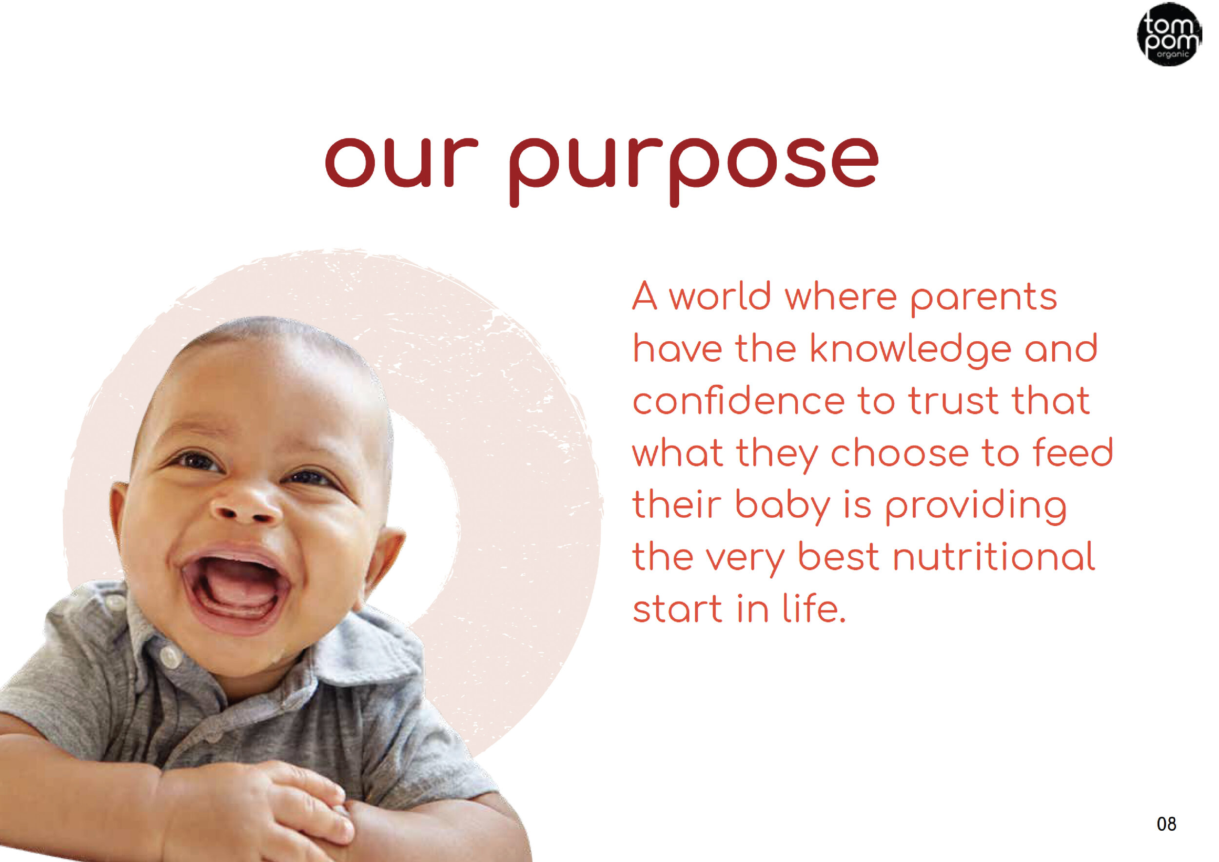
The brand had already been established but the client wanted to upscale and invest in a production facility. We needed to sense check what had been done so far by doing some brand strategy work to understand the potential audience, values and positioning. A thought through strategy would help to move the brand forward and reach its potential.
We started where you should always start – with the audience. And then conducted a series of brand strategy workshops to really understand them, their motivations, needs and wants. This helped us really define how Tom Pom Organic would be best placed to answer those needs.
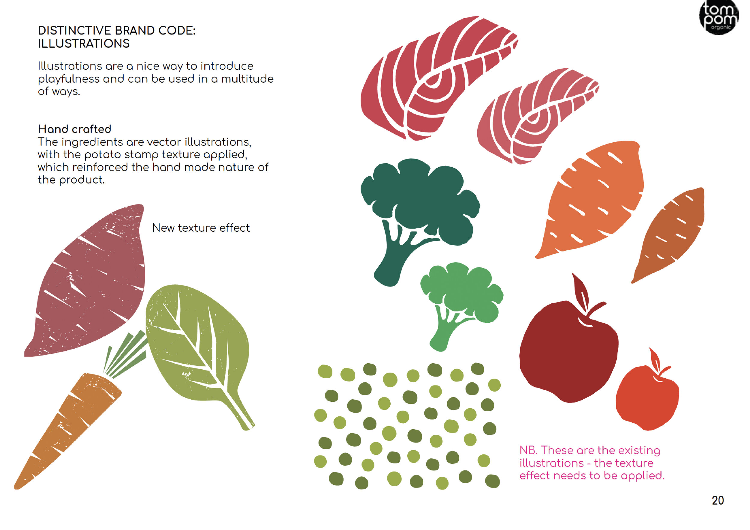
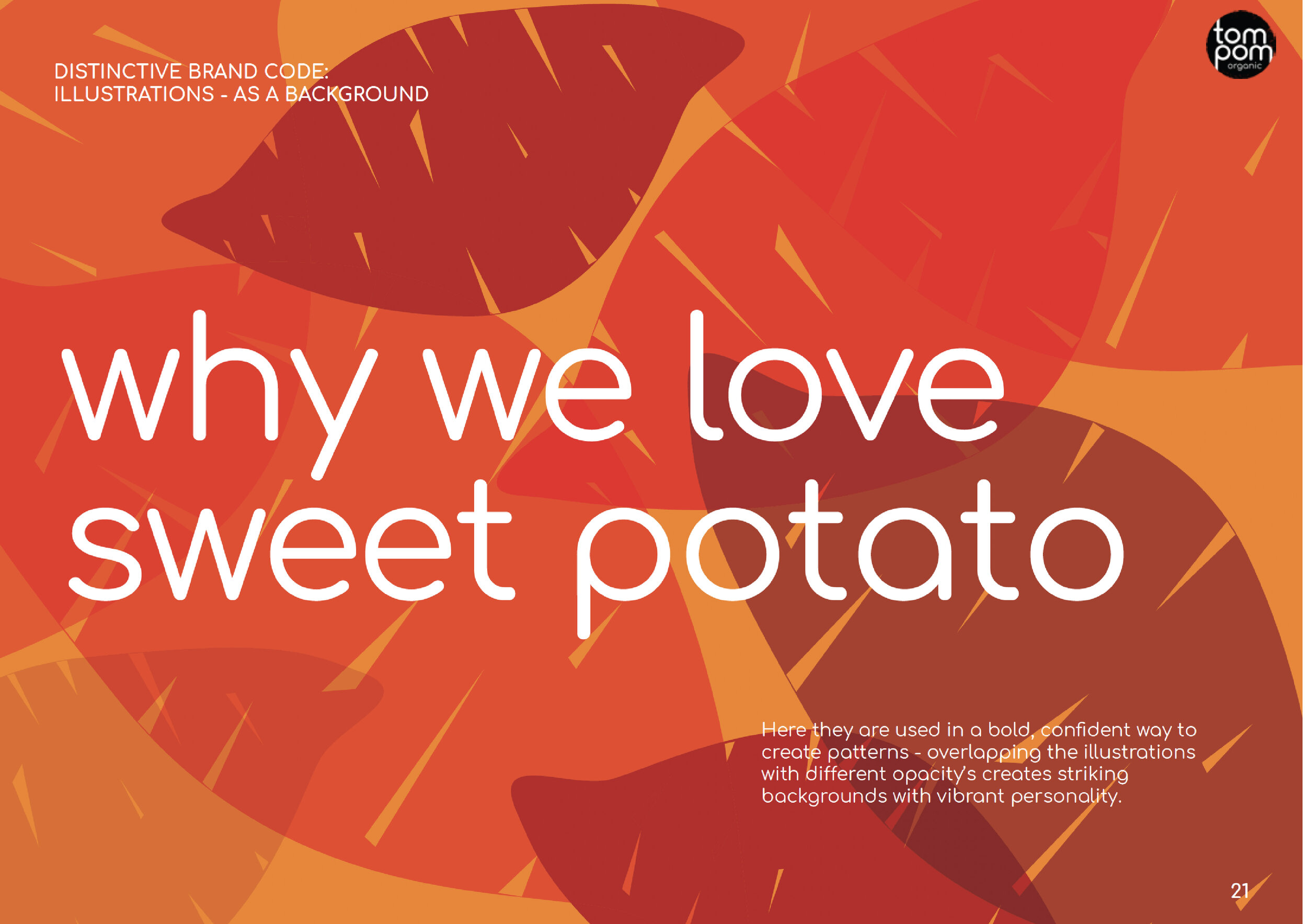
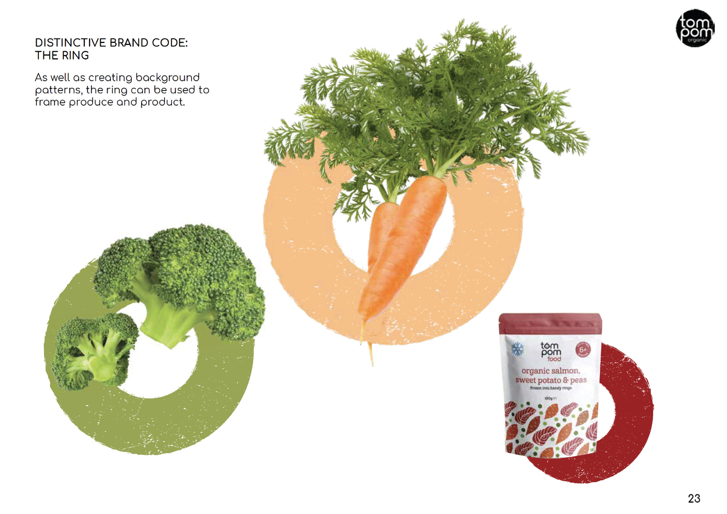
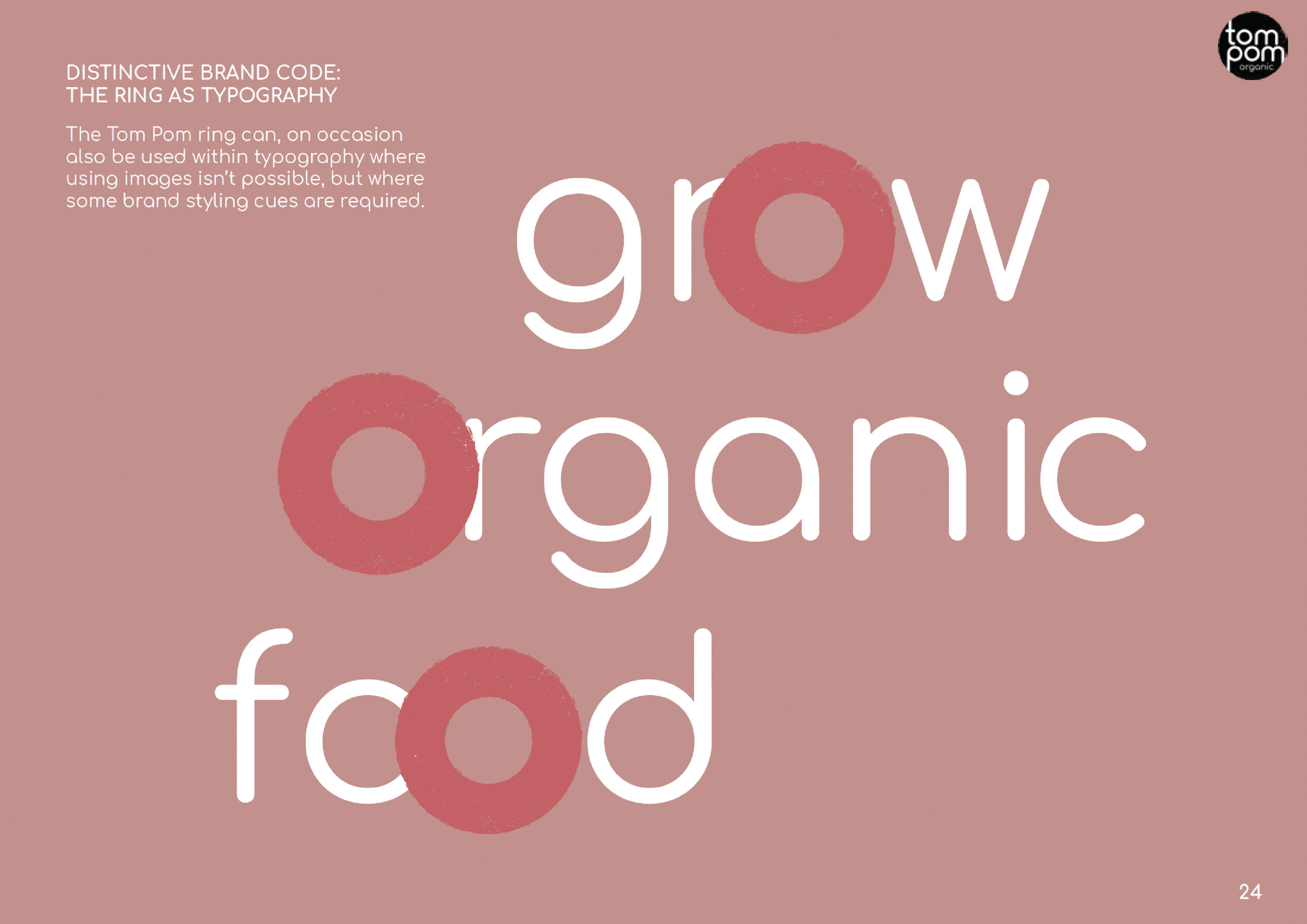
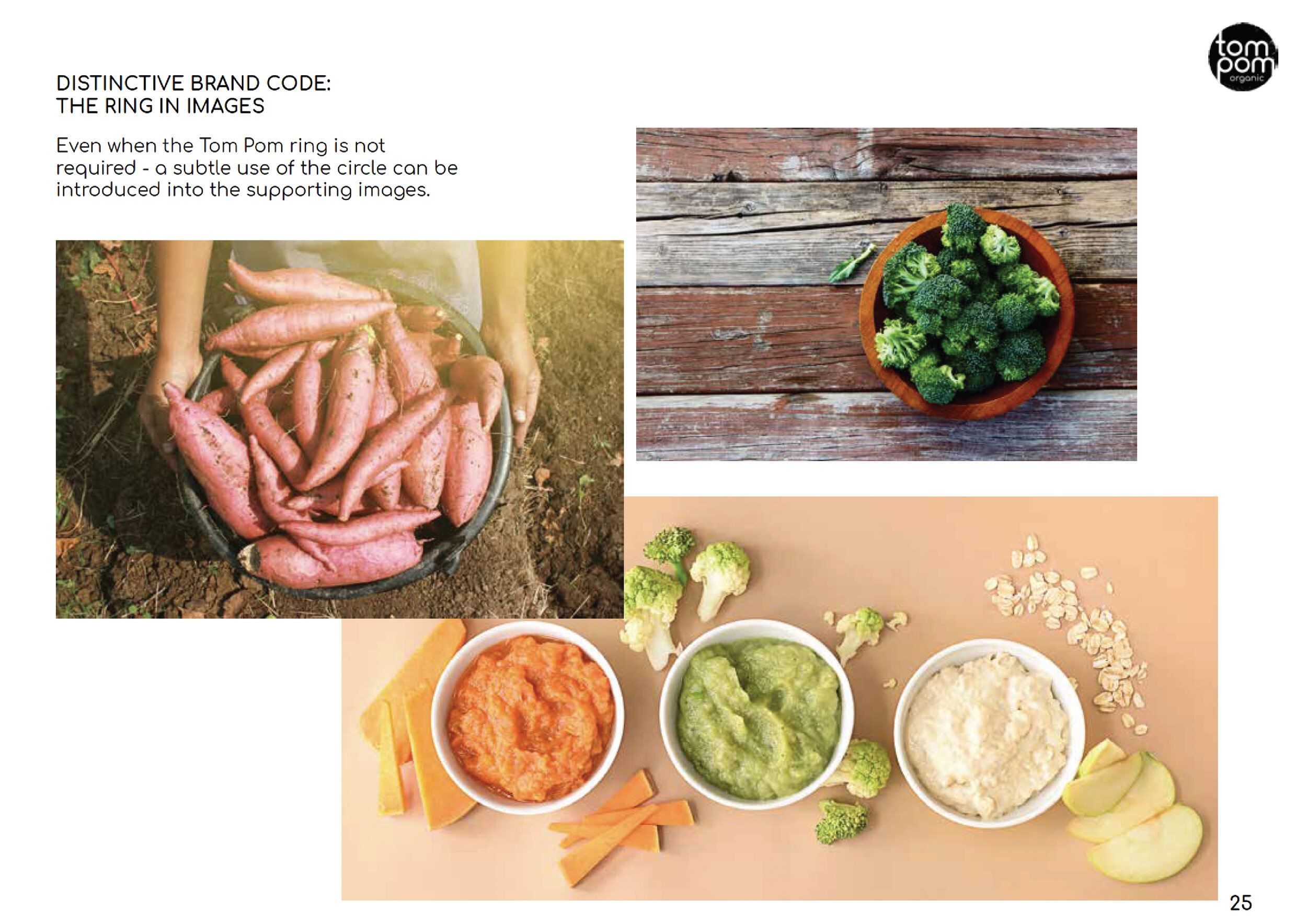
The designs played to the hand-made nature of the product with ‘potato print’ style graphics of the fresh ingredients, and we introduced a ring graphic to nod to the unique physical characteristics of the product.
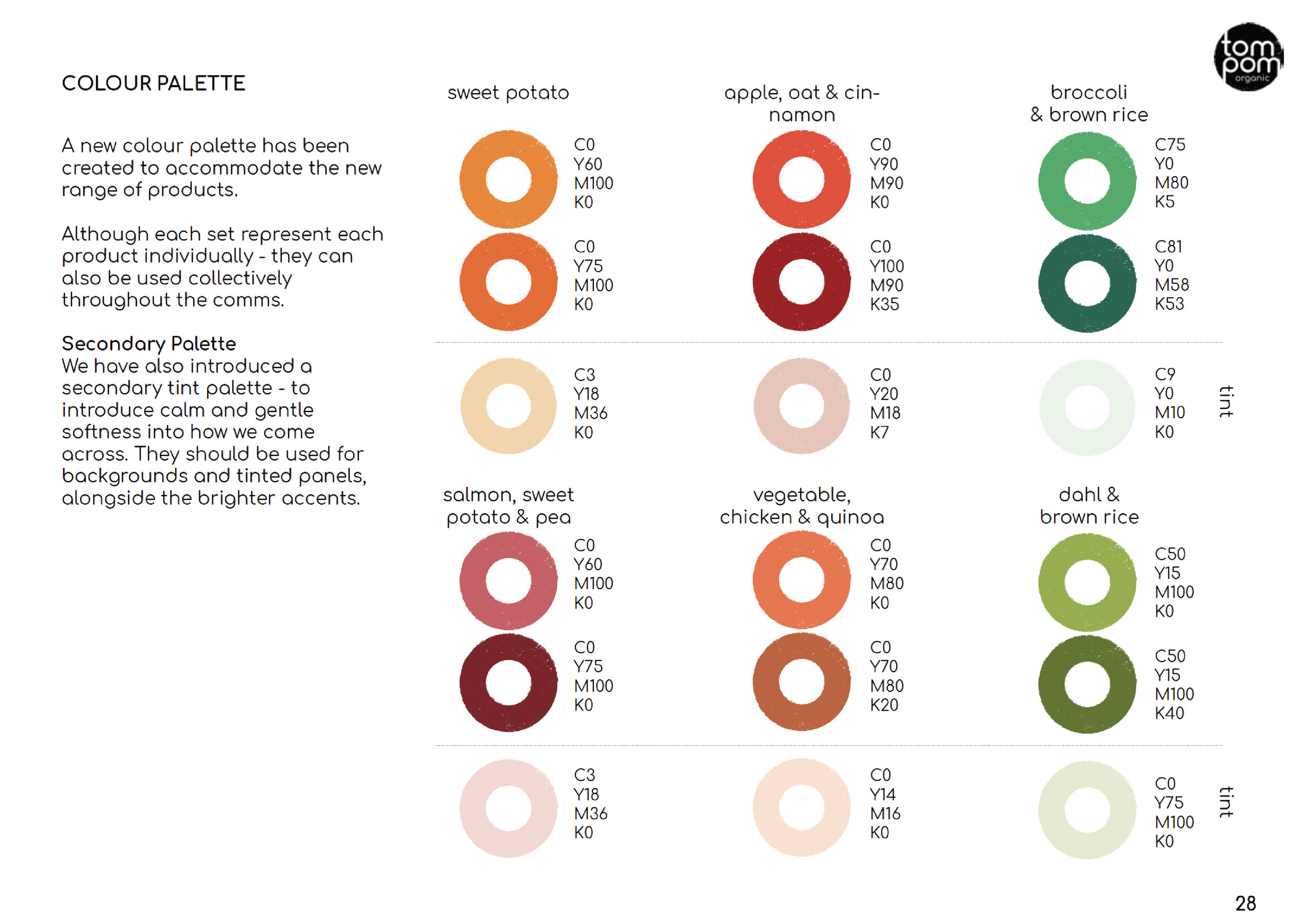
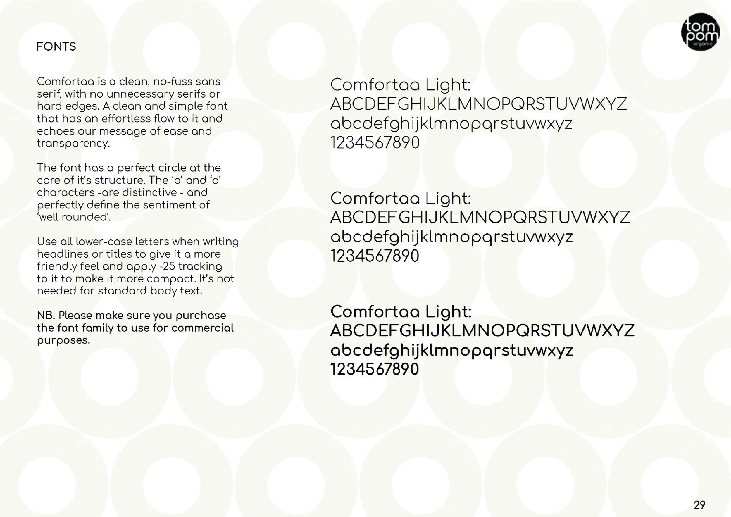
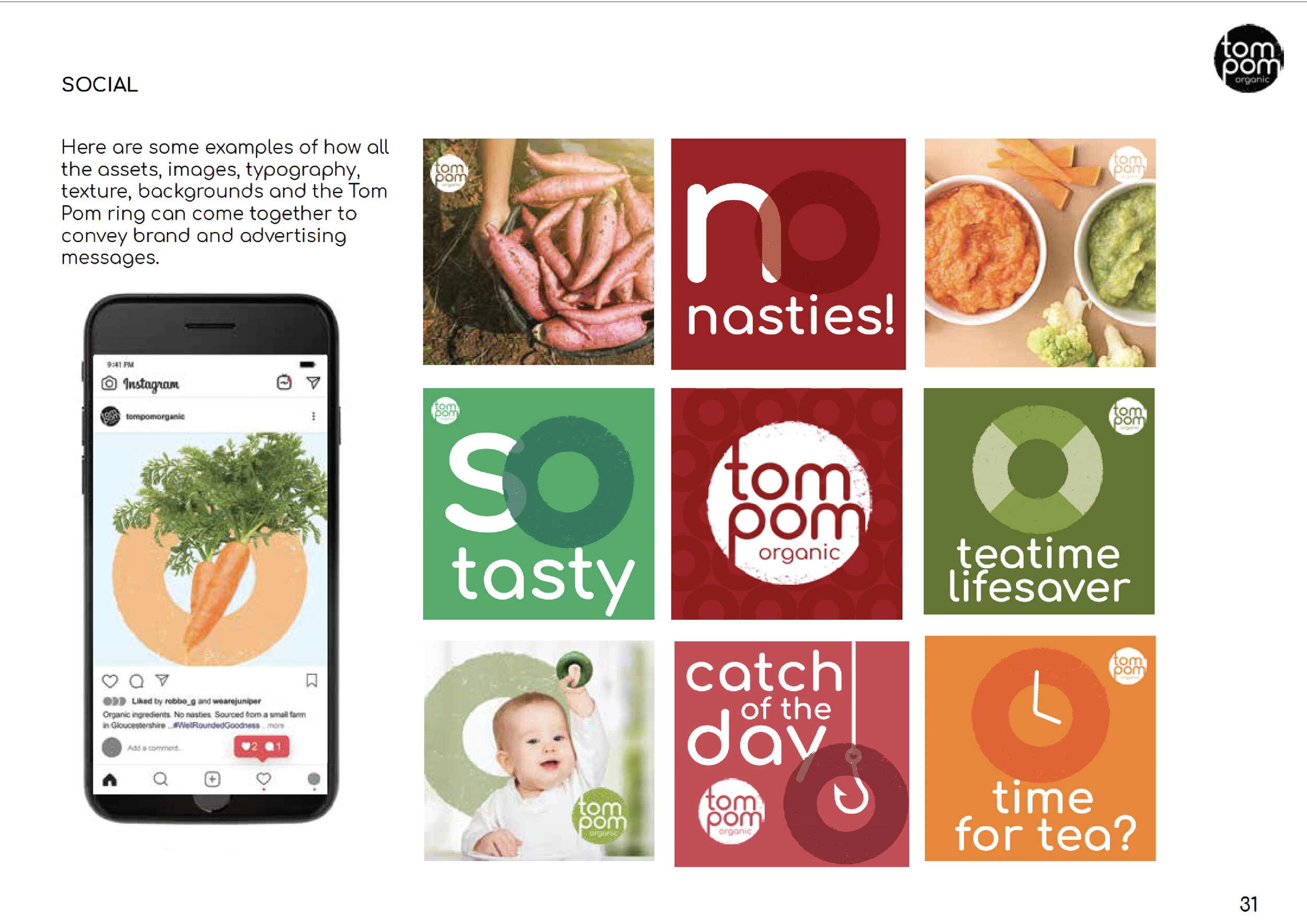
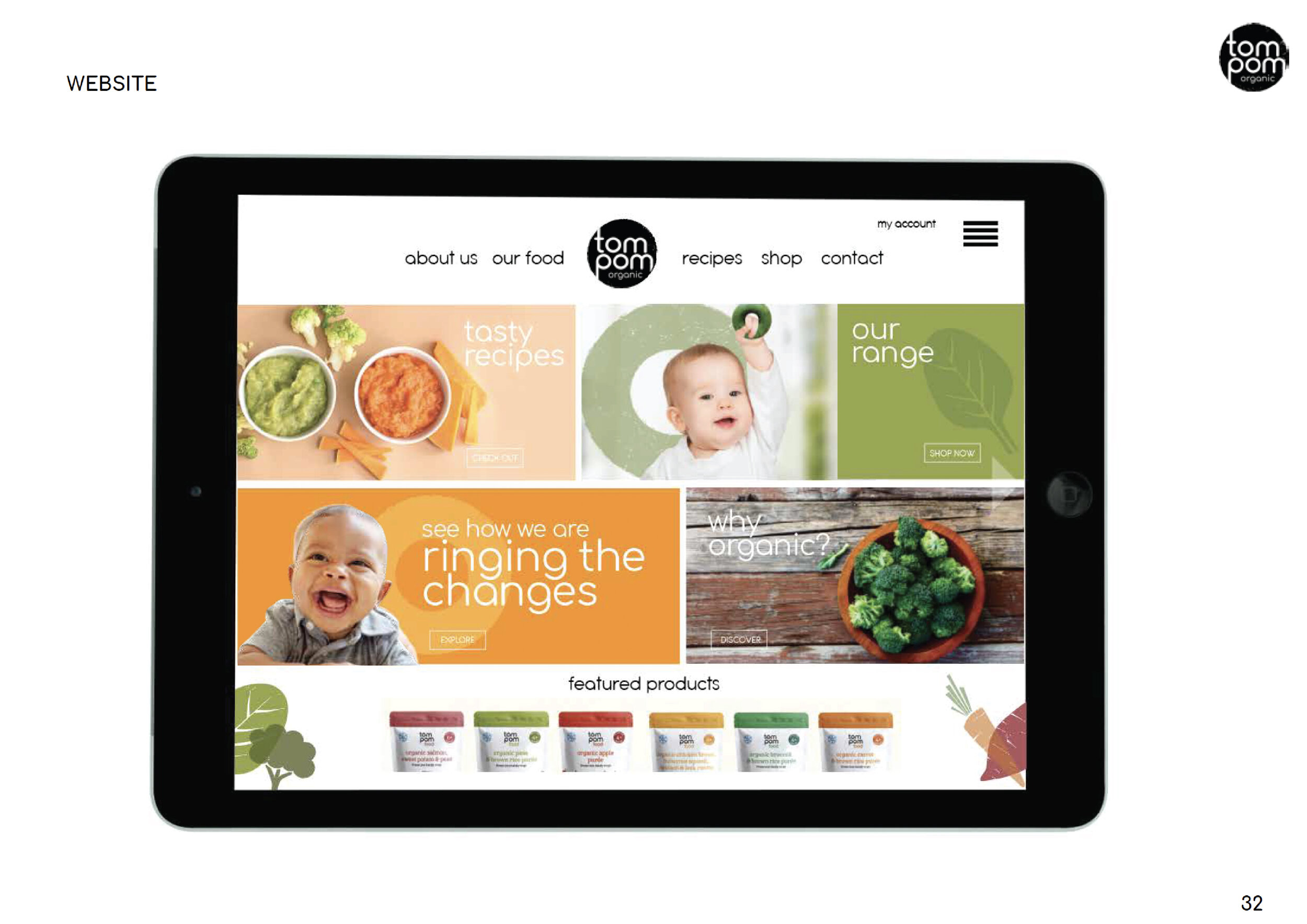
This work manifested in a comprehensive Brand Style Guide – positioning, brand icons, colour palette, fonts, and use of imagery and illustration – and how that could be applied to social , the website and of course, packaging.